Kamis, 25 Februari 2010

NSConference

I had intended to do a full writeup after my experience speaking at NSConference Europe, but with all the travel I've been doing lately and all the work that built up as a result, I just never got around to it. Now that the US edition of NSConference has come and gone, I don't want to miss writing up my feelings.

To put it bluntly, Scotty and his small crew (Tim, Robert, Dave, Claire, Lyndia, and (of course) Simon - did I miss anyone?) did an absolutely fantastic job both times, as did all the other speakers. I think I saw all the presentations at one conference or the other (and several at both), with the exception of Andy Finnell's, which is unfortunate, because people were absolutely raving about it in the U.K. Unfortunately, Andy wasn't able to speak at the U.S. conference, but I'm looking forward to seeing it on video.

Prior to the European conference, I had only met Scotty twice, once at WWDC, and then again in SFO as I was leaving WWDC for home. Scotty was heading to Atlanta to scout out locations for a new American edition of NSConference. I had only ever heard good things about NSConference, so I jumped at the chance to speak when he asked.

The funny thing is that my trip to England went wrong in nearly every way it could. I ended up at the conference with no clothes except what I wore on the plane, no shoes (only fuzzy slippers because it was a red-eye), and with a very severe case of jet lag. If you follow me on Twitter, you might have gotten the impression that I was having a miserable time.

Actually, nothing could be further from the truth. Despite the travel difficulties and inconveniences, people were bending over backwards to help me. The official conference crew are some of the nicest and most genuine people you'll ever meet. The attendees were just about as nice. I had a great time talking with so many people, and I can't recall a single moment I didn't enjoy. Heck, nobody even made any negative comments on the backchannel about the fact that I could barely keep my eyes open during my first presentation, or that I was giving my presentation in sweat pants and fuzzy slippers.

The sessions were great, and I honestly felt a little like I didn't belong on that speaker list (but, hey, I'm not complaining). Several of the speakers were introducing relatively new open source projects, including Aaron Hillegass' BNRPersistence, a lightweight persistence engine that uses a key-value store (Tokyo Cabinet by default) rather than a relational database and Marcus Zarra's ZSync an awesome looking framework for syncing data between Mac and/or iPhone applications. Drew McCormack, a core member of the Core Plot team also showed off that great framework's capabilities at the end of his presentation.

All of the sessions sparked good (and often lively) discussions and more than a few in-jokes, including many about KVO, delegates, time machines, and the mothers of all speakers with the last name of Lee. Most of the jokes would be hard to explain if you weren't actually there, but the fact that the group became so quickly comfortable enough together for these kinds of in-jokes to evolve really says a lot about the tenor of the conference. It really was the coming together of a community. In many ways, it felt like family. Hanging out was fun and you honestly felt sad when it was time to retire to your room for the evening (or morning, as it was).

I can't recommend NSConference more highly. Whether you're a professional or just a serious hobbyist, you really should plan ahead for next year's conference. The information you'll get is great, but more importantly, the connections and friendships you'll make will be invaluable. Plus, you'll have a blast.

I'll be back next year whether I'm asked to speak or not.

Senin, 22 Februari 2010

Drawing a HUD Display in OpenGL ES

One thing that I've been asked by a number of people is how to do a "heads up display" (or HUD) when using OpenGL to display three-dimensional objects inside a perspective viewport. Many games and other programs need to present certain data to the user as if it were written right on the screen in front of the three-dimensional world. But, if you've used glFrustum() to set up your viewport it won't look like that, since any drawing done in a perspective viewport will experience some amount of distortion when filtered through the projection matrix.

The answer to this problem is relatively straightforward and simple. You just don't let the HUD drawing go through the same projection matrix as the three-dimensional objects. Under the hood, the project view matrix is just a 4x4 matrix of GLfloats, exactly like the model view matrix we use to transform objects in our virtual world. And, just like the model view matrix, we can make changes to the projection matrix between drawing calls.

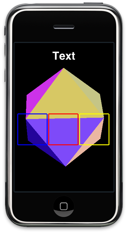
To illustrate the point, I'm going to take the old icosahedron project from the OpenGL ES from the Ground Up series and do some two-dimensional drawing on top of the icosahedron, exactly the same way you would draw a HUD. To keep things simple, I'm just going to draw a few squares and a bit of text, like so:
Screen shot 2010-02-22 at 2.35.14 PM.png

The three squares and text will be drawn using an orthographic projection matrix, so no matter how the object behind it is transformed, moved, or projected, the three squares and the text will be drawn exactly the same with no distortion or movement. You can use this exact same technique to draw the player's score, the crosshairs of a gun, a spaceship's controls, or any other drawing that needs to appear as if it was on a piece of glass in front of the virtual world.

Before we begin, let's look at the setupView: function where we set up the viewport in the old icosahedron project:

-(void)setupView:(GLView*)view
{
GLfloat size;
const GLfloat zNear = 0.1,
zFar = 1000.0,
fieldOfView = 60.0;
size = zNear * tanf(DEGREES_TO_RADIANS(fieldOfView) / 2.0);
CGRect rect = self.view.bounds;
glMatrixMode(GL_PROJECTION);
glEnable(GL_DEPTH_TEST);
glDepthMask(GL_TRUE);
glFrustumf(-size, size, -size / (rect.size.width / rect.size.height), size /
(rect.size.width / rect.size.height), zNear, zFar);

glViewport(0, 0, rect.size.width, rect.size.height);
glMatrixMode(GL_MODELVIEW);
glLoadIdentity();
glClearColor(0.0f, 0.0f, 0.0f, 1.0f);
colors = [[NSMutableArray alloc] initWithCapacity:20];
for (int i =0; i < 20; i++)
[colors addObject:[UIColor randomColor]];
}

It's pretty much a bog-standard perspective viewport setup that will allow our three dimensional objects to get smaller as they move away from the viewer. Everything we draw will be distorted to represent perspective, which we don't want for our HUD elements. So… let's create a couple of convenience methods to get out of perspective mode and into orthographic mode and vice versa

First, to switch the projection to orthographic mode, we'll use this method:

-(void)switchToOrtho 
{
glDisable(GL_DEPTH_TEST);
glMatrixMode(GL_PROJECTION);
glPushMatrix();
glLoadIdentity();
glOrthof(0, self.view.bounds.size.width, 0, self.view.bounds.size.height, -5, 1);
glMatrixMode(GL_MODELVIEW);
glLoadIdentity();
}

This is pretty simple, but let's break it down line-by-line. The first line is important. We don't want depth testing if we're drawing in two dimensions because we want all of our drawing done on the same plane with no depth.

Next, we call glMatrixMode() to make the projection matrix active. After that, we push the existing projection matrix onto the matrix stack so that we can restore it later. When this gets called, the projection matrix contains a matrix that was generated by our call to glFrustum(), and we need to be able to get back to it later. We then load the identify identity and then set up an orthographic projection where every screen pixel equates to one OpenGL unit, which will make our two-dimensional drawing easier since each unit will equal one pixel.

After that, we load the identity matrix into our model view matrix so we start drawing our HUD with a clean slate, unaffected by any previously used transformations.

In addition to a method to get into orthographic mode, we also need a method to restore our previous projection matrix, the one that we created in setupView:. Since we pushed the existing projection matrix onto the matrix stack earlier, All we have to do here is re-eneable depth-testing and pop our old projection matrix off the matrix stack:

-(void)switchBackToFrustum 
{
glEnable(GL_DEPTH_TEST);
glMatrixMode(GL_PROJECTION);
glPopMatrix();
glMatrixMode(GL_MODELVIEW);
}

Now we have the ability to switch back and forth between perspective and orthographic mode, so let's do some drawing. Here's the drawing method from the icosahedron project with the new HUD drawing code drawn in bold. I've used Apple's Texture2D class to handle the text drawing. I've done this just for simplicity - it's far from the most efficient way to draw text in OpenGL ES. In fact, it's quite inefficient, but it's easy and free. Perhaps I'll focus on better ways to draw text in a future posting, but this post is about HUDs, not about text, so we can live with a little inefficiency.

- (void)drawView:(GLView*)view;
{


static GLfloat rico;
static const GLfloat icosahedronVertices[]= {
0, -0.525731, 0.850651,
0.850651, 0, 0.525731,
0.850651, 0, -0.525731,
-0.850651, 0, -0.525731,
-0.850651, 0, 0.525731,
-0.525731, 0.850651, 0,
0.525731, 0.850651, 0,
0.525731, -0.850651, 0,
-0.525731, -0.850651, 0,
0, -0.525731, -0.850651,
0, 0.525731, -0.850651,
0, 0.525731, 0.850651,
}
;
static const GLubyte icosahedronFaces[] = {
1, 2, 6,
1, 7, 2,
3, 4, 5,
4, 3, 8,
6, 5, 11,
5, 6, 10,
9, 10, 2,
10, 9, 3,
7, 8, 9,
8, 7, 0,
11, 0, 1,
0, 11, 4,
6, 2, 10,
1, 6, 11,
3, 5, 10,
5, 4, 11,
2, 7, 9,
7, 1, 0,
3, 9, 8,
4, 8, 0,
}
;
static const GLubyte icosahedronNumberOfFaces = 60;
glClear(GL_COLOR_BUFFER_BIT | GL_DEPTH_BUFFER_BIT);

// Icosahedron
glLoadIdentity();
glEnableClientState(GL_VERTEX_ARRAY);
glTranslatef(0.0f,0.0f,-2.0f);
glRotatef(rico,1.0f,1.0f,1.0f);

glVertexPointer(3, GL_FLOAT, 0, icosahedronVertices);
for(int i = 0; i < icosahedronNumberOfFaces; i += 3)
{
UIColor *oneColor = [colors objectAtIndex:i/3];
[oneColor setOpenGLColor];

glDrawElements(GL_TRIANGLES, 3, GL_UNSIGNED_BYTE, &icosahedronFaces[i]);
}


glDisableClientState(GL_VERTEX_ARRAY);

static NSTimeInterval lastDrawTime;
if (lastDrawTime)
{
NSTimeInterval timeSinceLastDraw = [NSDate timeIntervalSinceReferenceDate] - lastDrawTime;
rico+=50 * timeSinceLastDraw;
}


// ------------------------------------------------
// Draw HUD ---------------------------------------
// ------------------------------------------------
[self switchToOrtho];

static const GLfloat squareVertices[] = {
5.0f, 150.0f,
5.0f, 250.0f,
100.0f, 250.0f,
100.0f, 150.0f
}
;

glLineWidth(3.0);
glColor4f(0.0, 0.0, 1.0, 1.0); // blue
glTranslatef(5.0, 0.0, 0.0);
glVertexPointer(2, GL_FLOAT, 0, squareVertices);
glEnableClientState(GL_VERTEX_ARRAY);

glDrawArrays(GL_LINE_LOOP, 0, 4);
glTranslatef(100.0, 0.0, 0.0);
glColor4f(1.0, 0.0, 0.0, 1.0); // Red
glDrawArrays(GL_LINE_LOOP, 0, 4);
glTranslatef(100.0, 0.0, 0.0);
glColor4f(1.0, 1.0, 0.0, 1.0); // Yellow
glDrawArrays(GL_LINE_LOOP, 0, 4);


glEnable(GL_TEXTURE_2D);
glEnable(GL_BLEND);
glBlendFunc (GL_ONE, GL_ONE);
glEnableClientState(GL_TEXTURE_COORD_ARRAY);
glColor4f(1.0, 1.0, 1.0, 1.0);
glLoadIdentity();
Texture2D *textTex = [[Texture2D alloc] initWithString:@"Text"
dimensions:CGSizeMake(100., 40.0)
alignment:UITextAlignmentCenter
font:[UIFont boldSystemFontOfSize:36.0]
]
;
[textTex drawAtPoint:CGPointMake(160.0, 440.0) depth:-1];
glDisable(GL_BLEND);
glDisable(GL_TEXTURE_2D);
glDisableClientState(GL_TEXTURE_COORD_ARRAY);

[self switchBackToFrustum];

lastDrawTime = [NSDate timeIntervalSinceReferenceDate];
}

We start off by calling our switchToOrtho method. We then define vertices for a square that will be drawn using GL_LINE_LOOP and submit those vertices using glVertexPointer(). After that, we call glDrawArrays() three times, changing the color and doing a translate transform between the calls so that each square gets drawn to the right of the previous one and in a different color.

After that, we use Texture2D to draw the word "Text" on the screen. Because this class essentially draws the text into a graphic context then creates a texture out of it, we have to enable (and then disable) a bunch of texture-related options.

After we're all done drawing, we call the other method we created, switchBackToFrustum, to switch back to perspective mode so that the next time our drawView: method is called, we're back in three-dimensional mode.

And that is all there is to drawing a HUD over a perspective viewport. You can download the Xcode project right here and play with it yourself.

Sabtu, 20 Februari 2010

Alley Gator

Alley Gator-1

Alley Gator by Glu Mobile - $0.99
Buy it now on the App Store

Alley Gator is more of a casual game, which is something Glu Mobile have steered away from in their past few releases. This is a game that is extremely simple to pick up and play for only 2 or 3 minutes if you really want to. This is a game that I have played very basic versions of before on the pc, usually as a dodgy flash game. I haven't seen any of these titles on the App Store before Alley Gator, but after playing this game it seems like a perfect match to the accelerometer.

For those who still can't tell what this game is from my cryptic clues Alley Gator is a tunnel-sliding game where you must tilt your way through sewers avoiding items that get in your way. What makes Alley Gator so much fun is that it looks absolutely beautiful with crisp, bright graphics. Glu Mobile has also priced this game very cheaply so it should appeal to the casual gamer. If there was anything I feel might be lacking in this game is a bit of variety in the game. I'll talk more about that later though.

Presentation


This is actually a super amazing looking game. When taking a look at the screenshots you can just tell that this game is pretty special. There are six different environments that your cute little Alligator has to work his way through, each with a distinct theme like being covered in grafitti or all iced over from a cold winter in New York. With plenty of objects in your way, this game looks stunning in it's full 3D on any device.

Alley Gator-2

Now the game is nothing like it looks in the screenshots. As you are hurtling down the various sewers the game is extremely fast paced. Especially in later levels you have no idea where you are going, often having a split second to veer away from an object hiding on a corner. The effects while going at a high speed work well, with the blurring of the screen much like what happens in the Need for Speed games. The game manages to keep it's great appeal and still looks fantastic. If there is anything you learn from this game, it's that Glu make their games look damn good.

Controls

This is such a simple game to pick up and play with excellent use of the accelerometer to play what was previously controlled by arrows on a keyboard. When you think about it this is actually the perfect title for the iPhone and I can't believe I haven't seen a title of this genre before on the App Store (There may be one that I have missed. If so please let me know in the comments section). This is a very hand-off title as there is little to actually do in the way of on screen buttons.

Alley Gator-3

To play this game you must tilt the device left or right to move your way around the sewer pipes. A small tilt to one side will keep you spinning around until you center your device. The games camera will rotate with you so there is no need to actually move your head as Alley Gator is always on the bottom of the screen, just the pipe moves. If you feel like braking because you can't control where you are going just tap and hold on the screen to slow down Alley Gator. Running into objects will slow you right down so you will lose time.

Gameplay


Alley Gator is a very simple game to play, tilt your way out of the sewer before the time runs out so you can save your Alligator from being stuck in the dreaded sewer. Apart from being very cute this game will challenge your reflexes as you hurtle around this pipe in a way that could quite possibly make you sick if using an iPad.

Alley Gator-4

There are 25 levels to complete, each gradually getting harder than the last to complete. As you progress more obstacles will appear in your way, often with a smaller gap for you to pass by it, the levels will get longer and it’s more of a struggle to make it through without picking up a heap of power-ups. The thing that is lacking in this game is a bit of variety as there is only one game mode which can get dry towards the end of the game.

Alley Gator-5

If you enjoy what is available and the genre as a whole then this is definitely the best I have played on any platform. Alley Gator has multiple power-ups to help you on your quest to get away from the sewer. Collecting a clock will freeze the time clock for a short amount of time. Collecting a potion will turn you into a huge alligator that is invincible to all objects in its path for a limited amount of time. And don’t forget the peppers! These are vital if you want to have a ‘perfect run’ by collecting all 3 and finishing the level in the required time.

This isn’t a game that is too overly difficult for a relatively casual gamer to complete and it will only take about an hour to finish. This isn’t the type of game to finish in one sitting though, you will probably get one or two levels finished per play as that’s the type of game this was designed to be.

Conclusion


The overall gaming experience in Alley Gator is fun and great for a casual play. Everything has come together in sync for a fun experience. Excellent graphics, easy to use controls, excellent use of the camera rotation and a fun gaming experience. This is one of the more involving $0.99 games you will come across on the App Store. This is a game that can run on any device, be played by anyone who knows how to move an iPhone left or right and be loved by people who have a strong interest in cute alligators.

For $0.99 you can’t even go wrong with this game. Even if you don’t particularly enjoy this game then you have just bought two soft serves in the form of some brilliant eye candy to show off to your friends. This is really a casual game for anyone and everyone.

Gameplay- 7/10
Graphics- 9/10
Controls- 9/10
Overall- 8/10
I would recommend this game if you enjoyed- iTunnel 3D

Kamis, 18 Februari 2010

Learn Cocoa is Printed

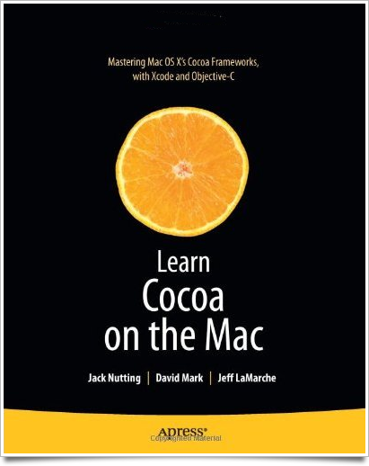
Learn Cocoa on the Mac from Apress should be available soon. Jack Nutting, the principal author, received his contributor copies today, so they should be making their way into the channel soon.

Learn Cocoa.png

I'm excited to read this book. That may sound like an odd statement from somebody's whose name appears on the cover of the book, but Learn Cocoa has a somewhat long and unusual backstory. Before I tell you about it, though, I think it's important to make sure that Jack gets the lion's share of the credit for this book. He's the one who toiled away doing the long hours writing. Dave also worked quite a bit on the book. Me? I didn't really do very much at all. I actually kinda feel bad that my name is featured so prominently on the book, to be completely honest.

Anyway, here's the abbreviated story of how Learn Cocoa came to be.

Back in late 2004 or early 2005, Dave approached me via e-mail about writing for MacTech Magazine. I didn't know Dave at the time except by reputation. I had read many of his books back in the eighties and early nineties. In 2005, he was the Editor-in-Chief of MacTech and had come across some open source application or project of mine and was just basically cold-calling me in a search for new authors. I liked writing, so I agreed to write an article. They liked it, and I started penning the Cocoa column for MacTech on a fairly regular basis shortly thereafter.

Dave and I hit it off right away. In late 2005, Dave asked me if I'd be interested in writing a book on Cocoa. Back then, he co-owned a small publishing company which was looking to fill a hole in their catalog with a book on Cocoa. They had Dave's Learn C on the Mac and Learn Objective-C on the Mac was being written.

Now, this was before the iPhone SDK. This was when Cocoa programming was still very much a small niche, but I was desperate for a way out of my day job doing enterprise software consulting, so I jumped at the chance, even though the book wouldn't likely make me enough money to bother with, at least directly. At very least, it would raise my visibility in the Mac dev community and might lead to more enjoyable work.

I began writing it, and Dave began working with me. And believe me, I needed the help. Writing a book is not an easy task. There's quite a chasm between being able to write a decent article and being able to write a good book. During this time, Dave and I began to work out the very time-intensive mode of collaboration we ended up using on both Beginning iPhone Development and More iPhone 3 Development. We worked for several months on Learn Cocoa, but not full time. We had to work around both of our other obligations.

At different points, our schedules would get busy and make collaborating difficult or impossible. After about 400 pages had been written, and maybe 100 of those pages had been edited and revised, I got on a crazy implementation project that left almost no time for working on side work like the book. Learn Cocoa began to wither on the vine.

And then, Leopard came out. Enough stuff in Cocoa changed between Tiger and Leopard, that I knew we had to go back and basically start over. The conceptual stuff was okay (and some of that actually made it into Beginning iPhone Development, most notably the discussion of Model-View-Controller, actions and outlets), but all the screenshots and step-by-step instructions had to change.

At that point, it just seemed like the book wasn't going to happen. Dave and I went our separate ways for a while, focusing on different endeavors and I gave up on my idea of going full-time as a Cocoa developer.

Then, a couple years later, the iPhone SDK was announced. Quite literally, the moment the announcement event was over, I called Dave and told him I wanted to write about the iPhone SDK. I didn't know that he was already in talks with Apress to sell SpiderWorks's catalog of books to them, and within a week or two, Dave and I had a contract to write Beginning iPhone Development for Apress. Apress still wanted Learn Cocoa, but they wanted the iPhone book much more, and that's what Dave and I wanted to work on.

Once Beginning iPhone Development was done, Apress started asking about Learn Cocoa, but I couldn't commit right away because I needed to make money after the long haul writing with no income. When we started seeing royalties from Beginning iPhone Development, I agreed to pick up and start working on the Learn Cocoa manuscript again.

Before I actually started working on it, though, someone came up with the idea of a follow-up iPhone book: the book that became More iPhone 3 Development. I don't remember exactly how it happened, but before long, I was switched to working on More iPhone 3 Development, and a new author had been recruited to work with Dave on revising and updating the Learn Cocoa manuscript. My name would be left on as a co-author, but I wouldn't be involved with the day-to-day aspects of the rewrite. So, I blew the dust off the incomplete, partially edited, and completely obsolete Learn Cocoa manuscript, and peevishly e-mailed it over to Jack.

He wisely decided not to use most of it and tackled the subject in his own way, which I'm very glad he did. I was welcome to be part of the process, but I was busy enough with More iPhone 3 Development that I didn't really look at more than a couple of the early draft chapters.

So that's how my name ended up on a book that I haven't actually read yet, at least not in its current form. But I have read enough to know it's a really good book, so congratulations, Jack!

Rabu, 17 Februari 2010

Opposite World

A lot of the web consists of reasonably well-written articles that lead off with sensationalist, often completely incorrect headlines designed to lure people to the site. I'm not a big fan of the approach, but there's no denying it's widely used.

Today, I ran across an article on the iPhone that was rather the opposite. I completely agreed with the headline and the basic underlying premise. Yet, I found myself scoffing (and sometimes giggling) at the rather ludicrous assertions sprinkled throughout what had promised to be a very reasonable and interesting article.

The premise of the article is that you can't beat the iPhone by copying it. Bravo. Obvious, but correct. You absolutely can't beat it that way. But, the rest of the article lauds phones that are basically doing just that and exhorts mobile device manufacturers to produce "almost as good" knock-offs of the iPhone with different form-factors. The disconnect here is hard to grasp. I half-expected the article to be penned by Henry Jekyll.

Here was the first gem of the article:
The first iPhone was maybe not a great phone, particularly feature-wise, but it has been universally acknowledged as a huge step forward in phone design.
What, pray tell, would constitute a "great phone", if not one that changed the industry and which the author himself acknowledged as "a huge step forward in phone design"? Are we judging against something that doesn't exist? Because if something is a huge step forward, it would seem, by comparison, to necessarily by "great" by any reasonable standard.

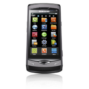
The article then went on to talk about the Samsung Wave, a phone that has been lauded by both Samsung and every single person that Samsung has paid to talk about it, as a "brilliant new smartphone". Here it is:

wave-1.jpg

Whoo-boy! Ain't that original. That doesn't look like Samsung is copying the iPhone at all. I mean, there are, you see, three columns of icons, not four. And there's a couple extra hardware buttons. Oh, and it says Samsung at the top, and has a slight taper. I'm so glad they're not copying Apple, like even down to the reflection of the phone in the official photo because that would just be derivative. And sad.

According to the article, this phone "presents a challenge to the iPhone…" because it has the same form factor (even though it's not copying the iPhone), has an app store (which isn't copying Apple's at all), and also has similar hardware (but again, they're not, and I repeat NOT copying the iPhone in any way, shape, or form).

Now, the author of this article is a "long-time developer of mobile products", so I guess I shouldn't expect him to get why the iPhone has been a success. I mean, he is part of an industry that had their collective asses handed to them by Apple, a company with no prior experience in the mobile space. But I am honestly wondering is if he came up with the headline on his own. Because, despite all the inanity in this article, I still agree with the headline.

The next gem is this:
The iPhone has not yet reached a level of emotional attachment where it will be bought even when reasonable substitutes exist.
Any person who could say this is somebody who has never spent time with any of the 50+ million actual iPhone users. I'm an iPhone user. I spent a week using the next best phone currently available: the Nexus One. The Nexus One is not a bad phone by any stretch of the imagination, but there's no way in hell I'm going to say "aw, well, I just want a phone, I'll give up my iPhone for something that looks similar but isn't a copy". I am very deeply attached to my iPhone, and so are the vast majority of iPhone users I've met. And it's not just Apple geeks and iPhone devs. I know many people whose computers run on Windows, yet they carry an iPhone and adore it. I know people who hate computers, who love their iPhone. But what is a "reasonable substitute"? A phone with similar specs? A similar form-factor? To put it bluntly: There are no "reasonable substitutes" currently on the market.

So, next, the author says:
The real turning point however, will be when developers stop trying to copy the iPhone’s design, and accept that they can create something unique and cool outside the iPhone’s form factor.
Then:
Increasingly, manufacturers are doing just that…
What? The manufacturers like Samsung? Let me know how that works out for you, 'kay?

The article then ends with this amazing bit of wisdom:
In 1997, the dominant phone in town was the Nokia 6110. Manufacturers found the only way to beat it was to create phones with different form factors, costs, and feature bases. From that, we saw innovation and segmentation in three key areas — features, cost, and size. We may just be in for a new wave of innovation.
Wow. Just… wow. What was that quote about people who don't learn from history? Hello? McFly? You just stated how mobile phone companies competed before the iPhone. You just brought up the staid, pathetic business model that the iPhone obliterated. Trying to bring it back isn't going to work. You can't compete on cost and make a profit in the long term. You can't compete on size, because it's already possible to make phones that are smaller than it's practical to actually use comfortably. That leaves, according to this amazing bit of wisdom… features?

The author so obviously doesn't get it. He's almost as far away from getting it as is it's possible to fucking be. As long as the mobile device industry keeps thinking like this, they will continue to play second fiddle (and third, fourth, and eighth fiddle) to the iPhone (and any other company that does get a clue).

Here's a hint: It's the fucking user experience. It's not the features, processor speed, or form factor. The iPhone had less features when it came out then the Palm and Windows Mobile phones that were already available, and it wasn't any cheaper or smaller. The iPhone became a sensation because it was easy to use and intuitive. You never had to train yourself to its idiosyncrasies. You never had to learn how the desktop computing paradigms were mangled down to fit on a small screen. You just picked it up and used it, and it was fun.

Make your phones easy. Make them fun. Make them as stress-free as possible, even for the stupidest, most un-tech-savy users. If you make phones that are easier and funner, you just might get yourself back in the game. But as long as you think of phones as a commodity with your whole "feature, cost, size" crap, you're going to keep on sucking hard.

But, hey! At least y'all got headline right.

Joy of Tech

Nitrozac and Snaggy seem to have similar views to mine when it comes to design by committee at Microsoft.

Selasa, 16 Februari 2010

Will Windows 7 Phone Be Awesome?

I hope so. Android is falling short of the mark and I'm not sure that the consortium model is capable of producing something better than decent. It's like design-by-committee on a grand scale. But if anybody has the horsepower for a come-from-behind win in the mobile space, it's Microsoft, their previous horrible mobile products notwithstanding.

When you think about the installed base of both Windows and Visual Studio developer tools that will be used to create apps for Windows phones, it's almost embarrassing that Microsoft hasn't done better in this space. Last time I checked, WinMo was down to something like less than 3% of the smart phone market share. Ouch.

But, there's hope on the horizon, it seems. Although the name needs some work, Windows 7 Phone Series looks to have been completely rethunk from the ground up. It doesn't look like Windows (even Windows 7). Gone is the Start Menu and process monitor. Gone are the Windows-style menus. No longer are they trying to take Windows and stick it on a phone. Maybe.

Jesus Diaz of Gizmodo is already declaring the yet-unreleased phone to be better than the iPhone. Of course, a recommendation from the usually-wrong Diaz is about as meaningful as a plug from Rob Enderle. But despite the fact that there's typical Microsoft best-blog-posts-money-can-buy FUD already showing up, there just may be something here. It certainly looks to be a huge step in the right direction at the very least.

I was impressed enough to check out the demo.

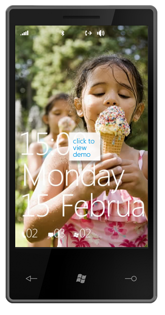
Screen shot 2010-02-16 at 9.30.47 AM.png


Well, it looks rather iPhone-ish. The corners look a little sharp, and they've committed the same sin as the Nexus one by putting a fricking hardware back button at the bottom. The concept of "back" is context sensitive and not always appropriate, so doesn't belong in a hardware button. Plus, there's some other button whose purpose fails to jump out at me. Perhaps someone at Bletchly Park might have been able to divine the button's purpose, but I doubt it will jump out at the average phone user. Overall, though, it's not a bad concept drawing. It is just a drawing, though, so can't tell too much about the actual hardware. But we can tell a fair bit about the software, so let's look at that.

The first thing that jumped out at me is that they cut off February on the welcome scren. WTF? Is this some stupid attempt to be avante garde, or did they just not fucking notice? Attention to detail counts, remember? Despite the protestations of certain geeks, the iPhone isn't popular because it's elitist or avante garde. In fact, it's quite the opposite. It's popular because it's easy and fun to use. You can't compete by copying the superficialities, even if you are the 800 pound gorilla of the tech world.

But, we're months from release, so I'll cut them a little slack on that one. The next thing I notice - the status bar? Yeah, it's invisible. Which means that the desktop picture shows through behind the status icons. That means the user is responsible for picking a background image that's dark enough for the status bar icons to be legible. Don't leave shit like that to the user, they're bound to screw it up and blame it on you.

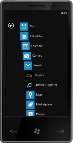
The thing that has Diaz's panties all in a bunch is the task-oriented workflow:

Screen shot 2010-02-16 at 9.47.13 AM.png


I don't get the fascination here. This isn't revolutionary. In fact, these are conceptually muddy buttons. They aren't distinct, and they don't accurately represent the things that a user is going to want to do. Why is Outlook a task rather than an application. It is just an application. Shouldn't it be "E-mail"? And why are Phone and People separate tasks? Who, exactly, are you going to call if not people? And what are you going to do with people if not call, text, or e-mail them? The concept of task-driven may be good, but this implementation of it seems shallow.

I applaud the desire to think differently and do something new, but it's not working here. I can almost visualize the meetings that resulted in this. Some manager from the Outlook group or marketing group insisted that e-mail be re-named Outlook for brand identity or simple ego issues. The Microsoft design-by-committee process is broken. Maybe less broken than it once was, but still broken. It takes good ideas from smart designers and engineers, chews them up, and spit them out as crap. Hopefully pretty crap, but still crap.

But, the Windows 7 Series Phone also has an application-centric view, just like the iPhone! Um, yeah. Great.
Screen shot 2010-02-16 at 10.04.13 AM.png

So, what's next? Ah, yes. Animations. Watch for a second before continuing on.

Okay, so we have eye candy at the press of the button on the main page that causes all the items to animate away. That's kinda cool, but why? What is the purpose? People often accuse Apple of having unnecessary eye candy, but if you look at it, you'll realize that most of it acts as powerful visual feedback. It's usually there to tell you something you might not otherwise notice. In this case, I guess you could argue that it tells you that you've moved to a new page, but that's not really something a user is bound to miss. I can forgive this one as showing off, though. These animations are hard to do right on a mobile phone, so I'll cut them a little slack for wanting to show what they can do in a demo.

But look at the keyboard animation. They take a second to fly in all the individual rows of keys to the keyboard. The first time, you're going to go "Cool!", every other time you're going to say "hurry the fuck up". Animations should never interfere with the user doing the natural thing they want to do. When I tap a text field, I expect to be able to type. Since this screen exists only to let the user search, why isn't the keyboard already being shown when I navigate there? Why do I even need to tap in the text field since it's the only control on the page? Oh, so Microsoft can show off their animations. No. You don't get it, Microsoft. It's not about you. It's about your user. Until you get that, your products will not be as good as they can be.

It's great that the Windows 7 Phone will have the infrastructure to do (hopefully GPU-powered) animations. It really is. Core Animation is the unsung hero of the iPhone's success from a technical standpoint. But it's nothing if not used right. Microsoft's UX team needs to get over the novelty of being able to animate and use the power to do so intelligently. Microsoft is using animation in this demo the way 90% of web designers used bevels and drop shadows in the 1990s, and that's not a compliment.

I know I'm coming across negative, but there's an awful lot of potential in this demo. There's the kernel of a truly remarkable mobile OS here, but you can already see how the design-by-committee is chewing on it.

Microsoft already has a base of developers who will jump on the platform if it's good, and quite a few consumers who will consider it if it's even in the same ballpark as the iPhone in terms of capability and functionality. Perhaps they realize they can shoot for mediocre and do a lot of advertising and FUD and show a profit. I'd really rather they did something truly great.

As it stands right now, I'm not betting on the Windows 7 Phone Series. But… here's my plea to the Microsoft designers and engineers: don't let stupid management decisions screw up what could be a great phone. At Apple, good design and engineering gets pushed and pushed hard from the top down. You don't have that luxury. Your "top" is filled with mediocre management types and your world is filled with bureaucratic in-fighting.

If you want to deliver a great phone, it needs to come from a ground-up revolution. Stick to your guns and fight against stupid decisions. Fight against marketing people making engineering and design decisions. Fight against the rush to get the damn thing out the door fast rather than right. Fight to prove me wrong. Please. You've got the ground floor of something awesome here, but it looks to me like your trajectory is set to completely miss awesome.

Please. Prove me wrong.

P.S. Here's a plea to Microsoft management involved with the phone. Let your people do their fucking jobs and stop second guessing their decisions. Your job should be to protect them from politics, infighting, and other forms of stupidity, not participate in it. Yes, it's a hard job, which is why you get paid more than them.

 
Design by Free WordPress Themes | Bloggerized by Lasantha - Premium Blogger Themes | Lady Gaga, Salman Khan