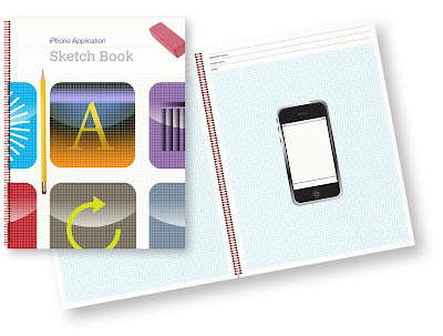
Well, only one day after finding out about the iPhone Sketch Book, one showed up in the mail. Very nice. The stencil I ordered a week and a half ago still hasn't shown up, so Kapsoft, the creators of the iPhone Sketch Book are already getting brownie points by being prompt.
The sketch book itself is quite nice. The cover design is professional looking, although the pink eraser and #2 pencil seemed out of place to me. Personally, those objects tend to make me think of elementary school as opposed to professional design. I probably would have opted for a mechanical pencil myself, but that's a tiny quibble if ever there was one. I know many people do, in fact, use #2 pencils and rubber erasers to do their designs.
The binding is a wire coil binding, which means it will lay flat on any page, which is a nice feature. Because it's a wire coil, the book will lay flat without having problems with pages coming loose like you have with plastic comb bindings.
The individual pages are nice. I'll be honest with you, I've been a sucker for graph paper since I was a kid. I loved it even before I started playing Dungeons & Dragons in the late seventies, and that hobby really reinforced my feelings for it. It's been years (decades, actually) since I've mapped out a dungeon on graph paper, but I still love graph paper, so I was thrilled to see that the background of each page is light-blue quad graph. And it's not that horrible 1/4" grid stuff, either. The grids are nice and small. And my love of graph paper isn't completely irrational. It gives you both vertical and horizontal guides for drawing shapes and letters, which lets someone with poor handwriting (like, say, me) to create something not completely horrible looking, which is nice if you're going to show something to a client.
The center of each page is an illustration of an iPhone drawn exactly to scale, which can be good or bad depending on your ability to draw small. There's a status bar at the top, and a black line at the bottom, the rest of the space is blank, ready for your designs.
And here's my one real quibble with the notebook. The status bar and the line at the bottom (that I assume is for a toolbar - it's too small for the Dock or for a tab bar) should have been drawn in non-photo blue like the background grid rather than in black. In any given application, a substantial portion of my views are unlikely to use a tool bar, and some applications won't show the status bar. Ideally, there should be light blue guides for tool bar, tab bar, nav bar, and status bar, but no black inside the iPhone's screen. It's not a huge deal, but I would definitely recommend that version 2.0 remove all black lines inside the screen space and replaces them with a light blue or light grey guideline that won't draw the eye if not used.
Other than that, though, the paper is thick and high quality, and the whole package gives off a professional air. I would not have any hesitation in showing a client designs from the sketchbook whatsoever. The book is thinner than the clipboard I currently use, so I plan to put my copy to good use.
Other recommendations I have for future versions of the iPhone Sketch Book: a version with the phone at 1.5 scale so it can work with the stencil, and one with the iPhone illustration only on the right-side pages, leaving the left side as just graph paper so that the developer has more space for notes about the view.
 09.16
09.16
 ipod touch review

 Posted in:


0 komentar:
Posting Komentar